ShopDreamUp AI ArtDreamUp
Deviation Actions


Description
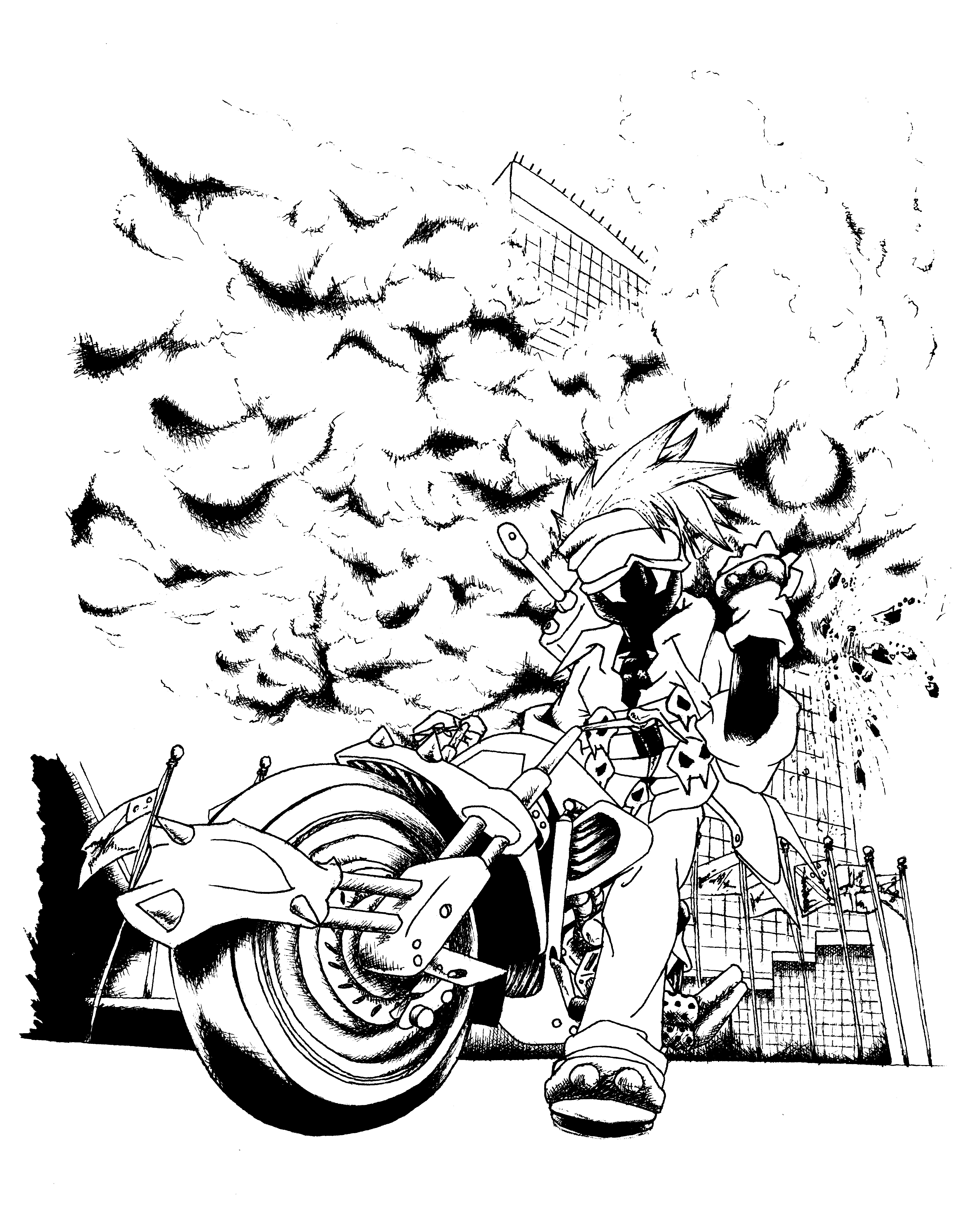
Approximately 16 hours worth of work so far, just to get the ink on to watercolor paper to prep for color. A little project for  of my character, WAR - doing something cool. War is based off of my brother (Bardiel), and I thought it would be perfectly fitting for him to be blowing up the United Nations Building. War's character is inspired by, Sol Badguy from Guilty Gear, Cloud Strife from Final Fantasy VII, and Todd McFarlane's Spawn. The Motorcycle is based on the Final Fantasy VII Hardy Daytona Design with some tweaks.
Faces in the clouds - [link]
Materials used (up to this point)
Berol 9H Turquoise Pencil
Berol 2H Turquoise Pencil
Sakura Pigma Series Micron .005, .01, .03 lineart pens
Copic Brushtip lineart pen
Standard 8.5" x 11" acid free paper
Tracing paper
9"x12" watercolor paper
of my character, WAR - doing something cool. War is based off of my brother (Bardiel), and I thought it would be perfectly fitting for him to be blowing up the United Nations Building. War's character is inspired by, Sol Badguy from Guilty Gear, Cloud Strife from Final Fantasy VII, and Todd McFarlane's Spawn. The Motorcycle is based on the Final Fantasy VII Hardy Daytona Design with some tweaks.Faces in the clouds - [link]
Materials used (up to this point)
Berol 9H Turquoise Pencil
Berol 2H Turquoise Pencil
Sakura Pigma Series Micron .005, .01, .03 lineart pens
Copic Brushtip lineart pen
Standard 8.5" x 11" acid free paper
Tracing paper
9"x12" watercolor paper
Image size
4797x5969px 4.43 MB
Comments32
Join the community to add your comment. Already a deviant? Log In
The thing that struck me the most was the impact of this graphic novel like piece. I love the down-up perspective as it contributes nicely to the explosive/adventure-like factor in this work. The perspective is pulled off nicely. The character design is impactful and unique, very cool. <img src="e.deviantart.net/emoticons/b/b…" width="15" height="15" alt="
Maybe the things that I would critique more on is the lining/shading. It's already really good, and I love the way the smoke from the explosion is done. However, the picture could have more midtones (such as, the folds and creases of his shirt, maybe a shiny glare on the motorbike?) as that would increase the dynamic wow factor. Also, more focus on line quality would be nice, such as ending a line softly in a crease, or making the line thicker while drawing the heavy metallic parts of the bike.
All in all, this is an impressive traditional piece.